Laying the Foundation
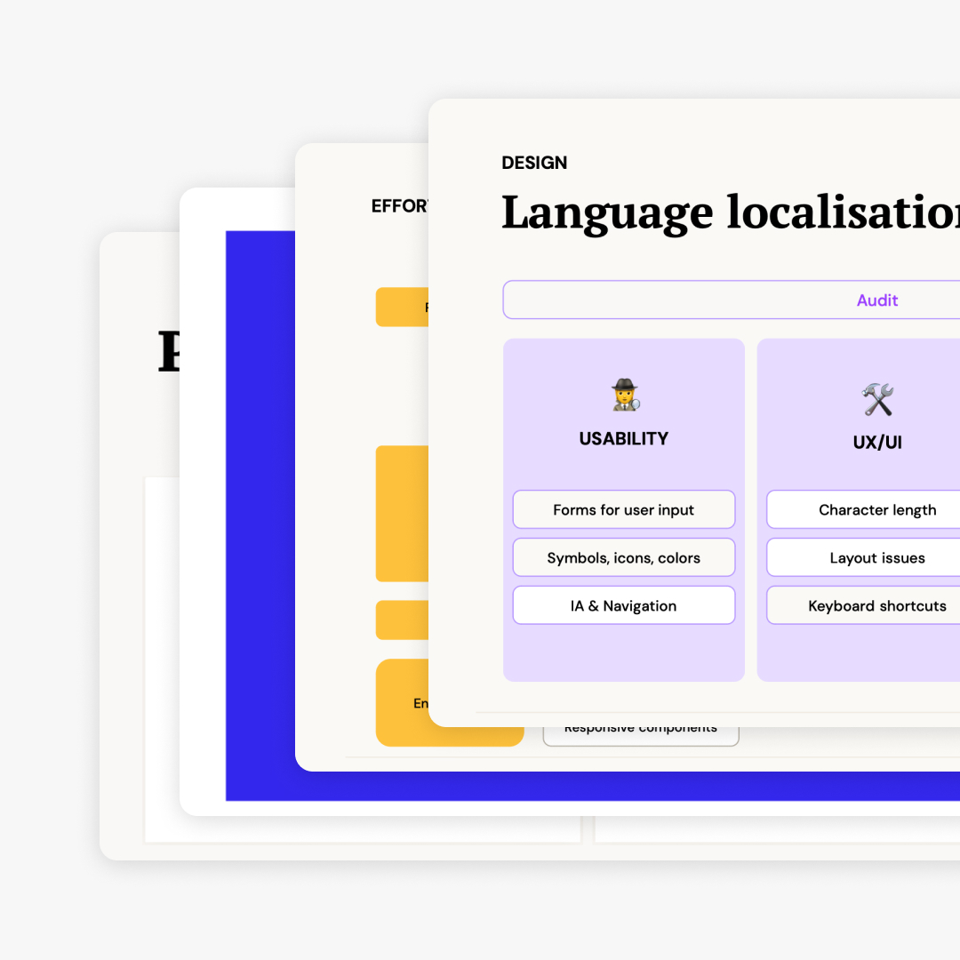
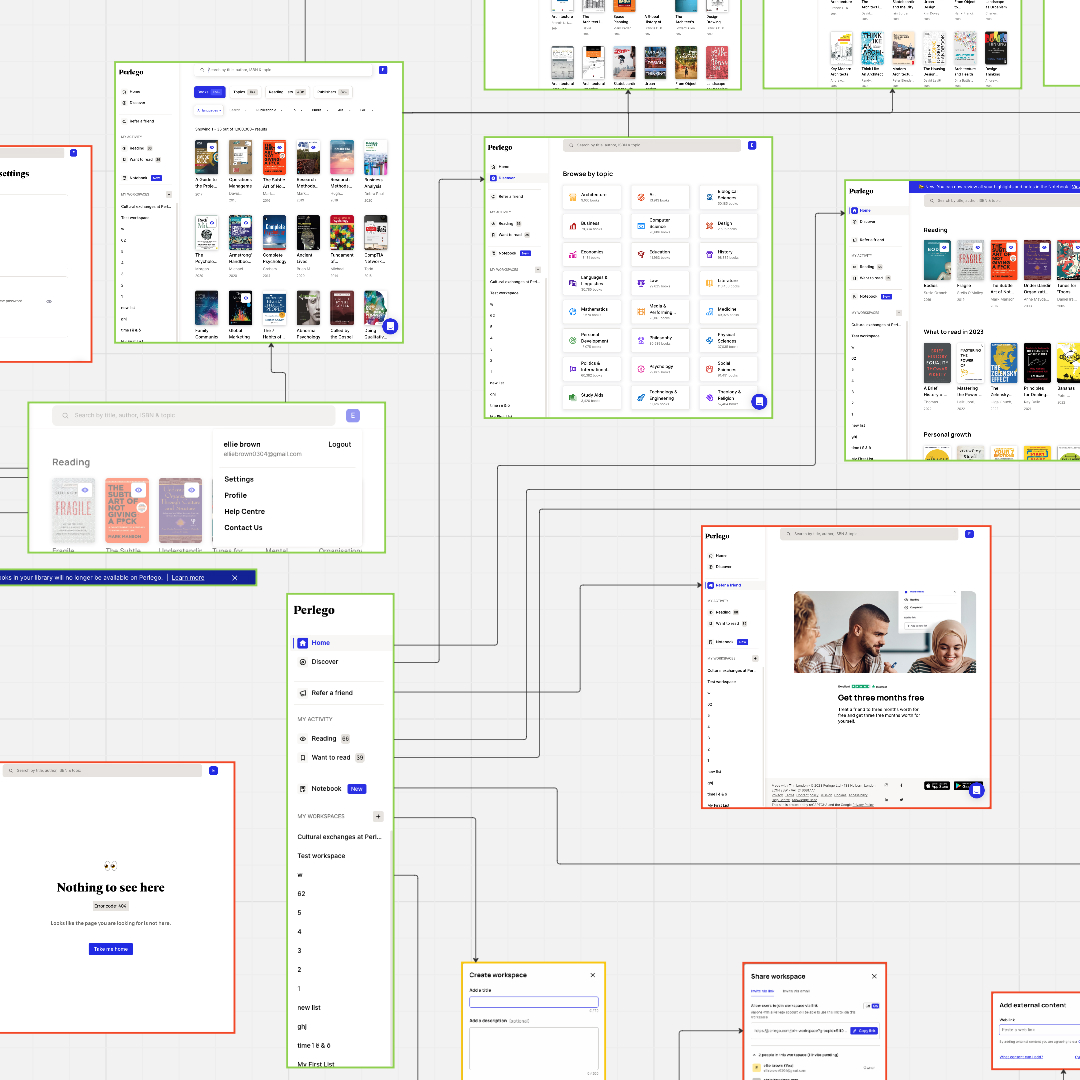
During the initial stages of the project, I worked with the product team to identify the project’s desired outcomes. I helped uncover UX focus areas and shared best practices for localising a product. Additionally, I helped outline the main user journeys for both logged-out and logged-in experiences and identified which journeys needed to be translated first. We collectively decided to start by translating the product into one language, assess its impact, learn from any mistakes, and then roll out the remaining languages later.
Gathering Insights
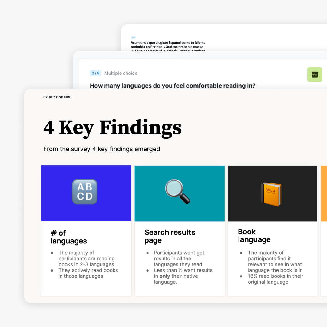
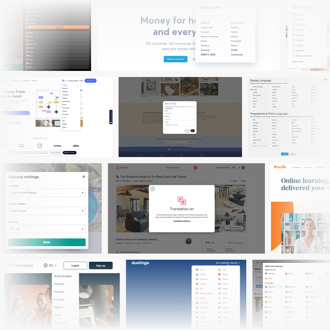
As the plan took shape, I conducted user interviews with current international Perlego users to understand how they search for and consume non-English titles, and how a translated platform would impact their experience. I also conducted competitor research to understand common patterns and expected behaviours and summarised my findings in a research presentation.
Crafting Flows
After discussing the research results with project stakeholders, we started planning the user flows for both logged-in and logged-out users and brainstorming the default platform behaviours. I collaborated with the website and mobile app engineering teams to determine the best way to identify the user’s default language on their respective platforms and allow users to choose their preferred language if the default selection was incorrect. I created user journeys that closely mirrored the entry points and core journeys of our existing user base to account for all possible scenarios.
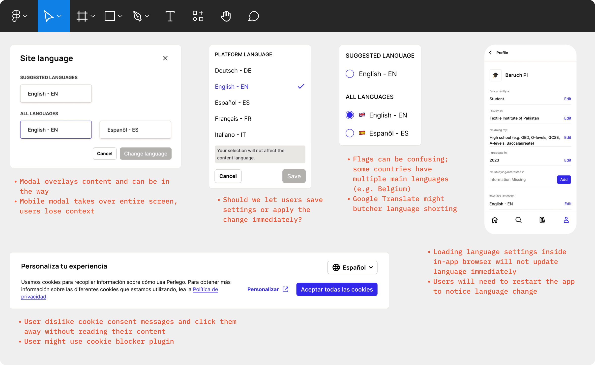
I began prototyping different UX solutions for the language selector and worked with the team to establish the do’s and don’ts of our solution.
Testing the Experience
I collaborated with the Internationalisation team to develop Spanish prototypes and tested them with Latin American web and app users. The new user journeys received positive feedback, but existing users had trouble locating the language settings after logging in.
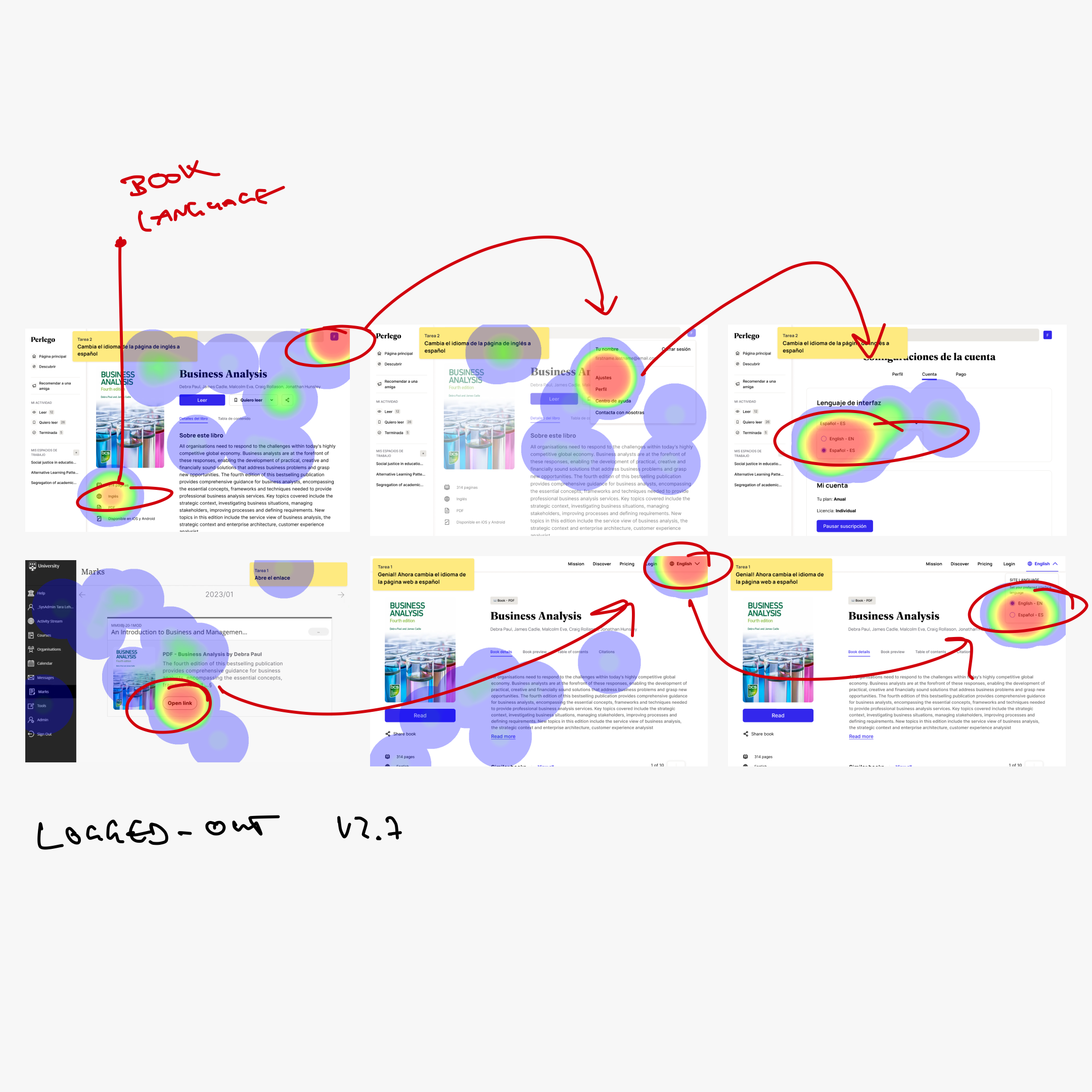
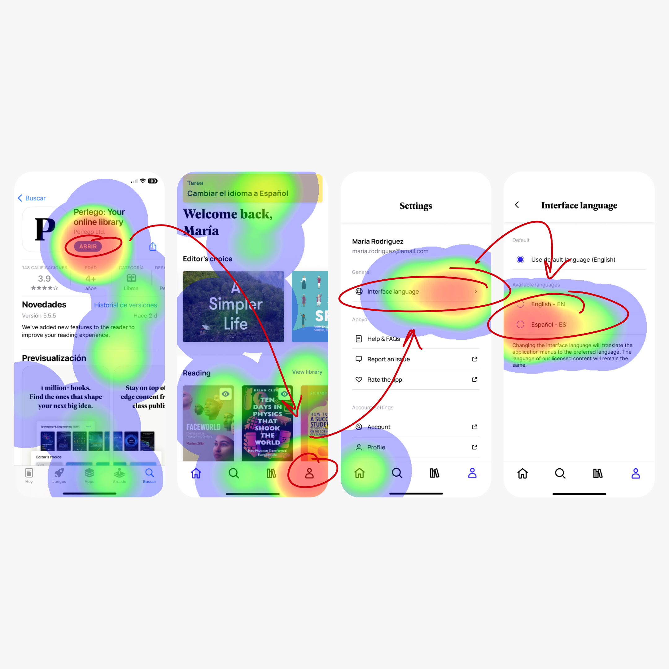
I reached out to the Internationalisation team to clarify some of the feedback and examined the prototype heatmaps. I noticed that while most users had no trouble with the mental model of finding the language settings in their account settings, they had difficulty locating the language settings once within the settings menu.
I addressed this issue by simplifying the settings menus and adding a language selector to the site-wide footer as a backup solution. After rerunning the usability test, the feedback was overwhelmingly positive.
I addressed this issue by simplifying the settings menus and adding a language selector to the site-wide footer as a backup solution. After rerunning the usability test, the feedback was overwhelmingly positive.
Scaling Impact
Once we tested, reviewed, and launched the platform in Spanish and other languages, Perlego saw a significant increase in the adoption of international book titles as entirely new user segments discovered and embraced the service.
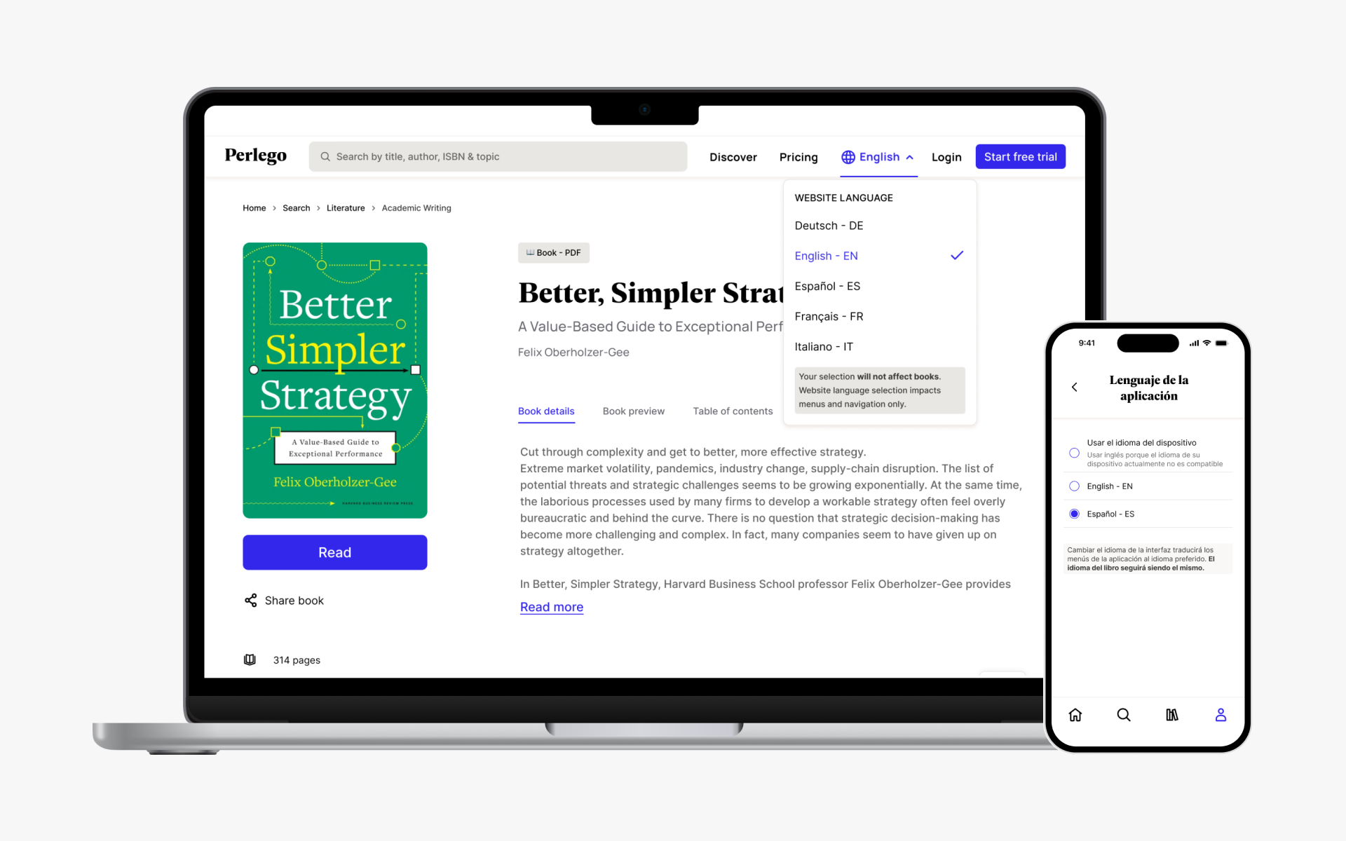
The project was a massive team effort and taught me to work efficiently across five different teams. From understanding the platform behaviour of existing users to tackling the user journeys with different engineering teams and testing solutions with an international audience, this project continues to make a difference for users worldwide.
